Parameter-parameter plots (pp-plots), see Cook, Gelman, and Rubin (2012) provide a method to test data simulation and data analysis software for biases.
In this post, I'll go through an example creating PP plots from simulated data where we know the results are unbiased and then bias them in order to understand the effect.
First, the base script:
#!/usr/bin/env python
import numpy as np
import bilby
from bilby.core.prior import Uniform
import pandas as pd
import tqdm

np.random.seed(1234)
sigma = 1
Nresults = 100
Nsamples = 1000
Nparameters = 10
Nruns = 1

priors = {f"x{jj}": Uniform(-1, 1, f"x{jj}") for jj in range(Nparameters)}


for x in range(Nruns):
    results = []
    for ii in tqdm.tqdm(range(Nresults)):
        posterior = dict()
        injections = dict()
        for key, prior in priors.items():
            sim_val = prior.sample()
            rec_val = sim_val + np.random.normal(0, sigma)
            posterior[key] = np.random.normal(rec_val, sigma, Nsamples)
            injections[key] = sim_val

        posterior = pd.DataFrame(dict(posterior))
        result = bilby.result.Result(
            label="test",
            injection_parameters=injections,
            posterior=posterior,
            search_parameter_keys=injections.keys(),
            priors=priors)
        results.append(result)

    bilby.result.make_pp_plot(results, filename=f"run{x}_90CI",
                              confidence_interval=0.9)
    bilby.result.make_pp_plot(results, filename=f"run{x}_3sigma",
                              confidence_interval=[0.68, 0.95, 0.997])
This simulated a set Nresults results, each with Nparameters
and for each parameter we simulate the posterior with Nsamples samples.
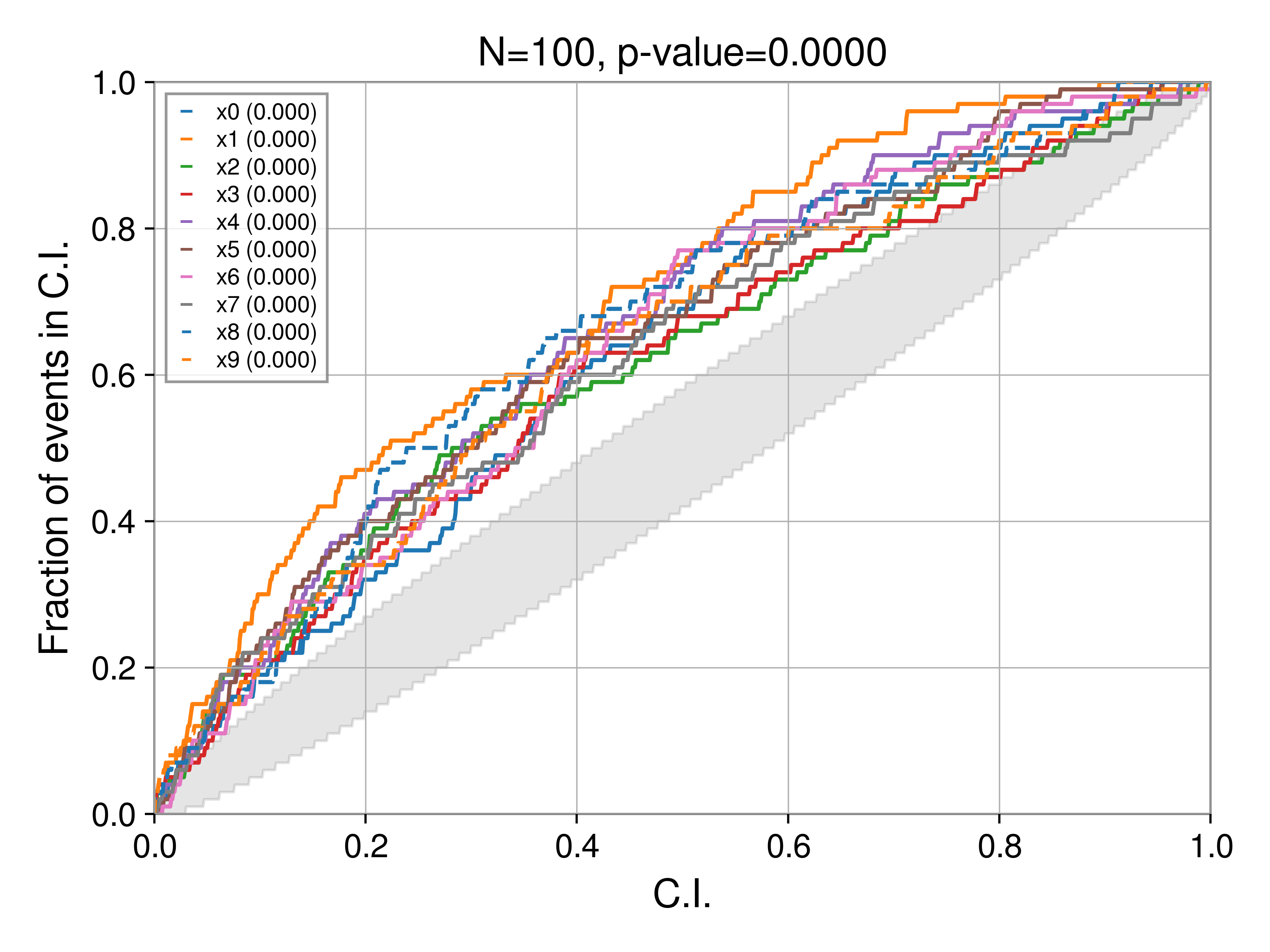
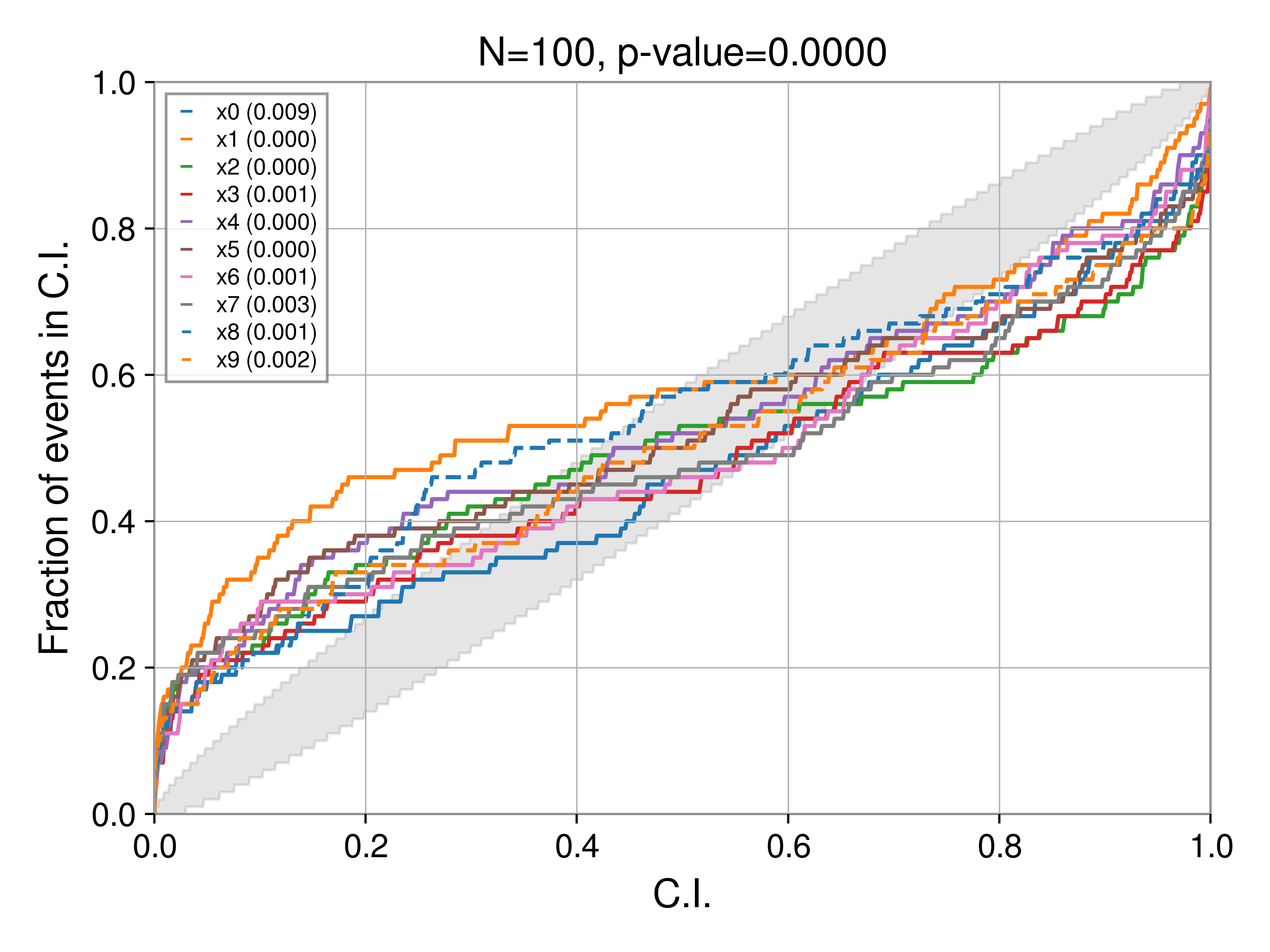
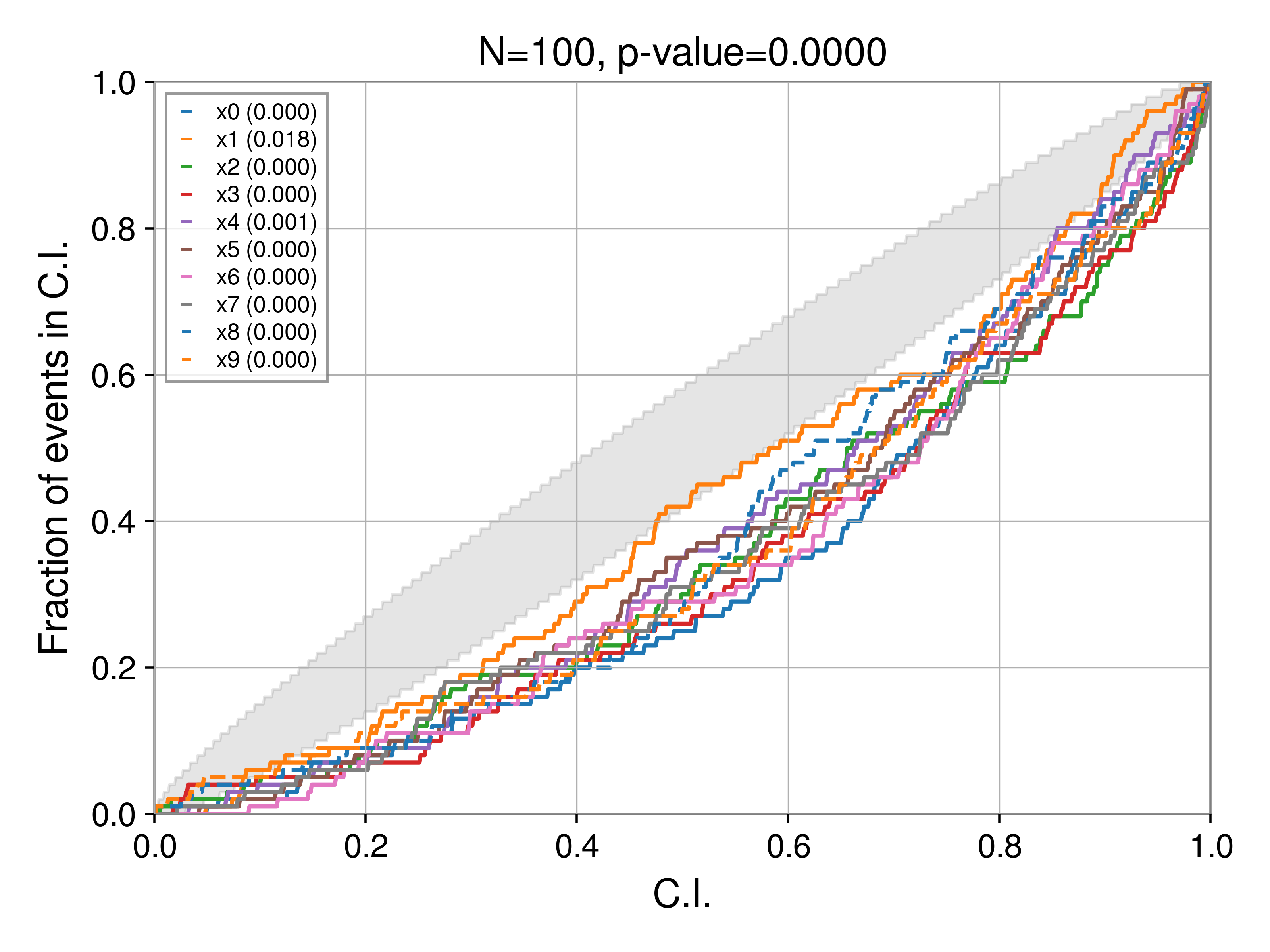
Background contours
In the script, we generate two sets of PP plots, one with 90% C.I:
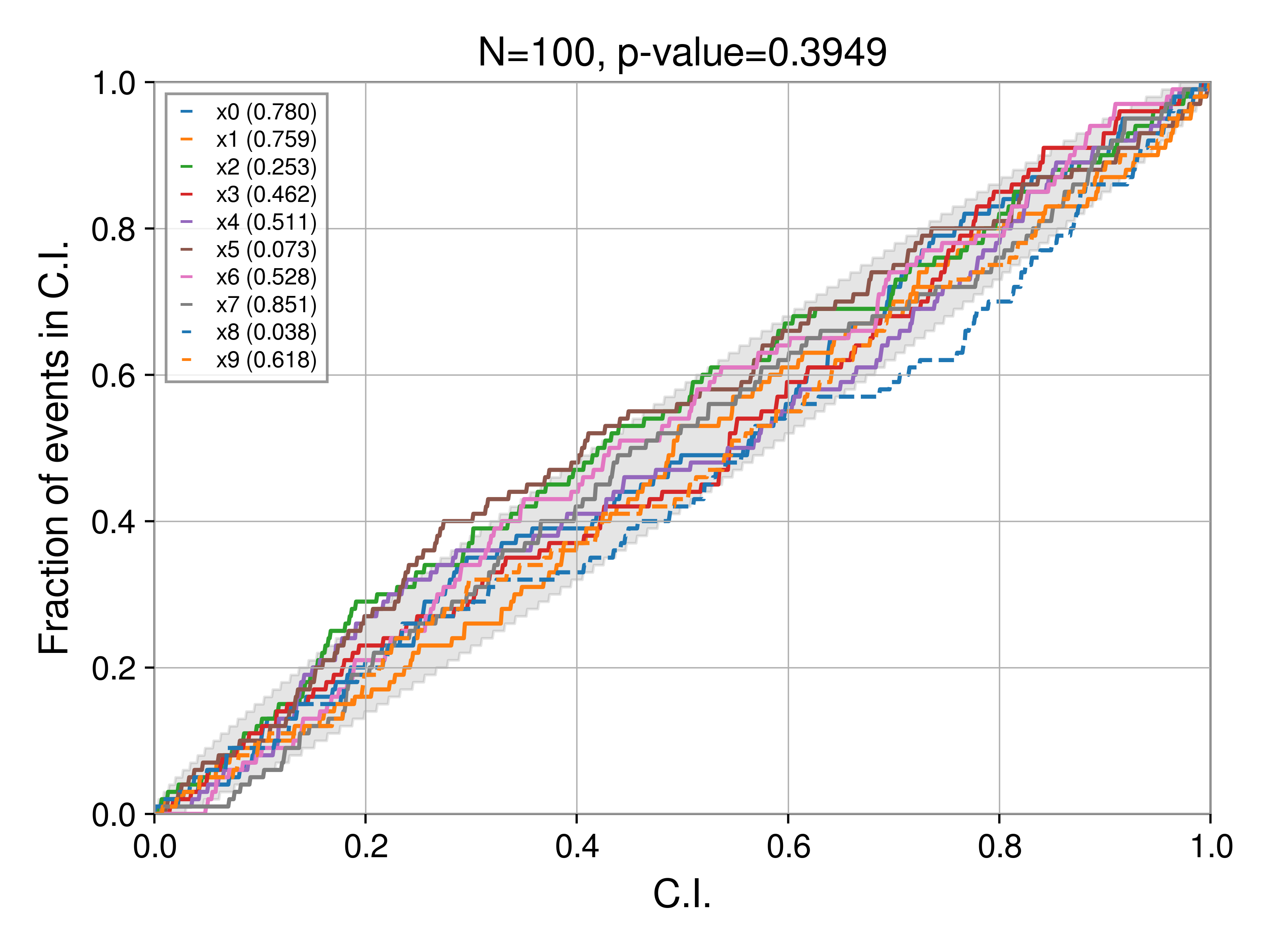
and one with a 1-2-3 sigma C.I:
These are, of course identical with respect to the parameter curves, only the background CI changes. Notably, for a 90% C.I. we see at least one parameter (the dashed blue curve, in this case x8) stray outside the bound. This is expected, the 3-sigma bound is 99.7%, much wider than the 90% bound. Which bound you choose is up to you, but should be kept in mind when evaluating results (and hence always reported alongside the plot). For all the plots in the rest of this post, we'll use the 90% C.I.
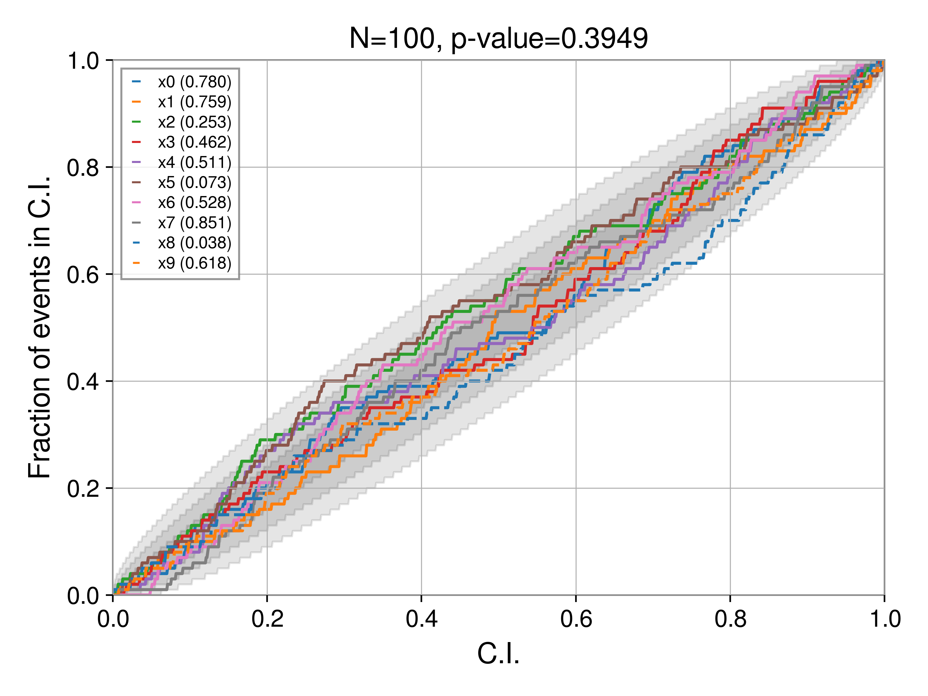
Bias: under constraining the posterior
Using the script above, we can investigate how biases manifest in PP tests. First, let's understrain the posterior. In particular, we replace the line
posterior[key] = np.random.normal(rec_val, sigma, Nsamples)
with
posterior[key] = np.random.normal(rec_val, 1.5 * sigma, Nsamples)
i.e., the posterior is wider by a factor of 1.5 than it should be (if perfectly recovered). Now, the PP test produces:
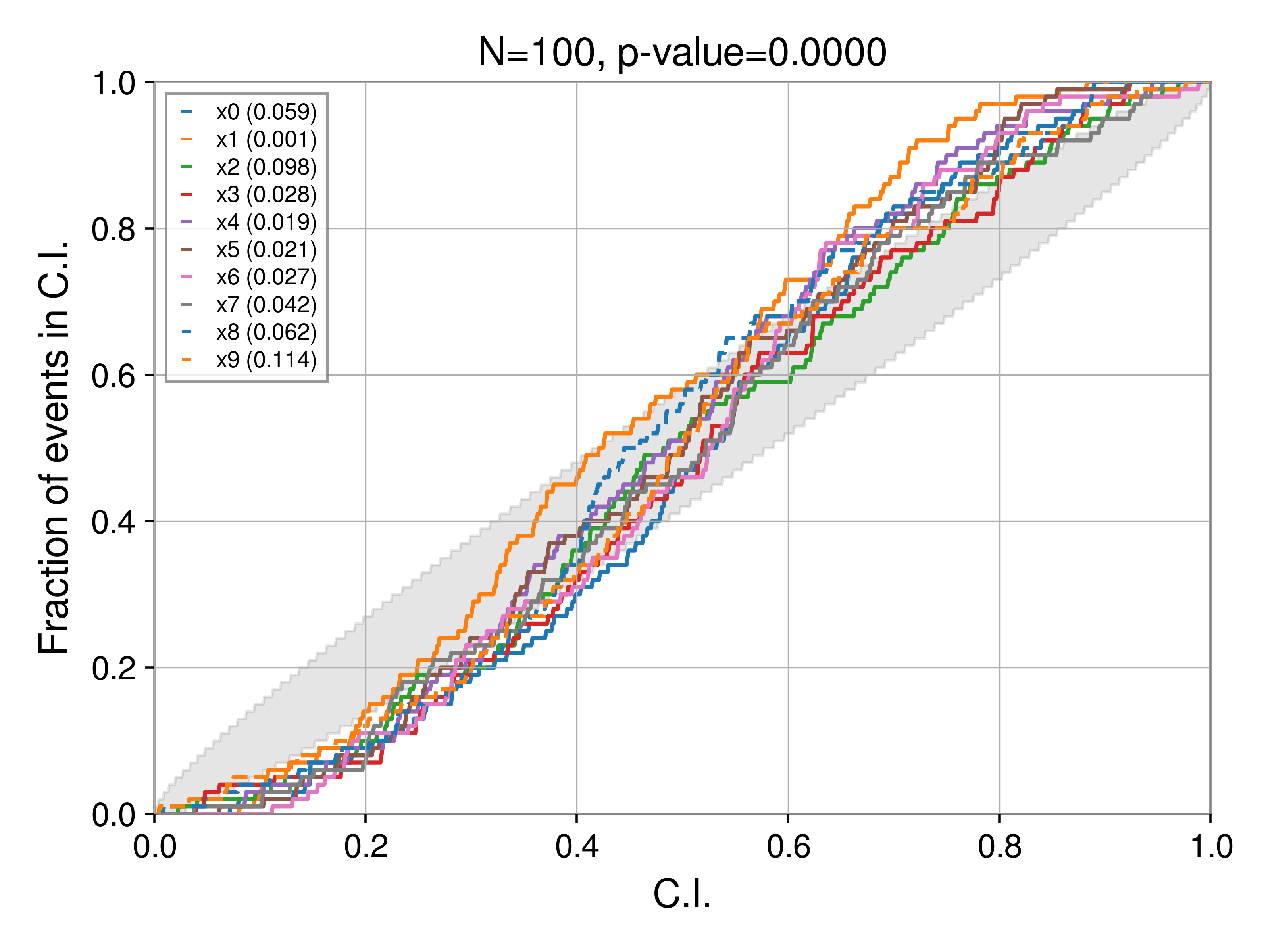
Bias: over constraining the posterior
If instead, we over constrain the posterior, i.e.,
posterior[key] = np.random.normal(rec_val, 0.5 * sigma, Nsamples)
then
Bias: shifting to the left
If we shift the posterior to the left:
posterior[key] = np.random.normal(rec_val - 0.5, sigma, Nsamples)
then
Bias: shifting to the right
If we shift the posterior to the right:
posterior[key] = np.random.normal(rec_val + 0.5, sigma, Nsamples)
then